Worcester
The Newsboy
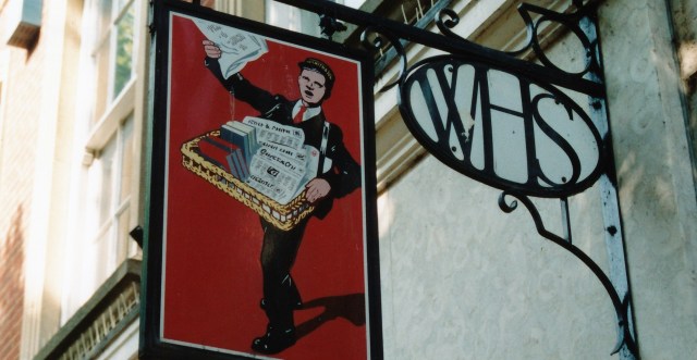
W. H. Smith’s distinctive enamelled hanging signs depicted a newsboy crying his wares against a bright red background. The newsboy was designed for Smith’s in 1905 by the artist Septimus E. Scott (1880-1966). Scott had trained in his native Sunderland and went on, in the 1920s, to design railway posters and illustrations for well-known brands such as Rowntree and Wincarnis.

Chester
Although many newsboy signs were taken down in the 1950s and 1960s, some still hang outside Smith’s shops, for example in St Albans, Stratford-upon-Avon, Worcester, Chester, Newtown (a restored shop in Powys accommodating the W. H. Smith museum), Cirencester and Durham. These signs are not absolutely identical. Not only do the brackets vary, but the style and composition – showing a newsboy brandishing a newspaper, with a tray of books and papers slung around his neck – evolved through time.

Stratford-on-Avon, still with some lettering on the bracket

St Albans, incorporating the egg monogram
Old photographs reveal that some newsboy signs had a boxy shape: these were actually ‘boy lanterns’, illuminated internally by electricity. Sometimes the lantern fixtures are still in place.

Salisbury
The newsboy wasn’t restricted to hanging signs and lanterns: he could appear in the most unlikely places. At Salisbury, in 1933, the refurbished shop was topped by a clock turret with a jaunty newsboy weather vane.
The Egg
In 1905, R. P. Glossop designed a new logo for W. H. Smith’s, comprising the initials ‘WHS’ expanded to fill an oval frame.

Monmouth
This ‘egg’ monogram served multiple functions. It can be spotted, for example, on mosaic floors in Monmouth, Fowey and Llandrindot Wells, on oak stall risers in Rickmansworth, on a brass name-plate in St Albans, and even on the wrought-iron bracket of the hanging sign in Worcester (see above). Archive photographs show the egg monogram adorning the lanterns that once illuminated Smith’s railway bookstalls, and even on floor mats inside the shops.

Rickmansworth: this would have been coloured blue and gold
Bow Windows and Bull’s Eye Glass
W. H. Smith consciously opted for an olde-worlde image, not unlike Boots’ ‘black and white’ shops of the pre-1914 period. The company favoured shallow bow windows divided into small panes in Georgian fashion – sometimes on upper elevations as well as on shopfronts.

Winchester
These bow windows included so-called ‘bull’s eye’ or ‘bottle’ glass – not in every pane, but set at random. Bull’s eye glass makes a feature of the pontil or punty scar, which remains at the centre of a disc of spun crown glass when the rod is removed. Smith’s glass, however, would have been moulded rather than spun: it was not the real thing. Like many other aspects of W. H. Smith’s shopfronts, it was included to evoke the Tudor period.

Tenby
Bull’s eye glass also appeared in the small panes of the transom lights (or ‘weather screen’) that ran across the top of shopfronts, for example at the Letchworth branch which opened in 1907, when Smith’s bookbinding factory first moved to the town.

Rickmansworth
Smith’s shopfronts were usually recessed, with projecting display cases at either end, and were of natural, unpainted oak. The soffits were decorated with plaster motifs. A lot of the shops designed by Smith’s in-house architect Frank C. Bayliss (d.1938), made extensive use of Cotswold stone, laid as ‘coursed rubble’ – not rubble in the usual sense of the term, but blocks of stone roughly dressed in a vernacular manner. This can be seen on the upper elevation at Winchester, framing the façade at Weston-Super-Mare, and on the stall risers in St Albans and Leominster.
Ornamental Leadwork
From 1906 until 1921 W. H. Smith occupied a corner property in Stratford-on-Avon which was associated with Shakespeare’s daughter, Judith (listed Grade II*). The firm decided to build larger premises nearby in 1921-23 (by Osborn, Pemberton & White with Frank Bayliss; listed Grade II), but also ‘restored’ the old shop.

Stratford-on-Avon
This work was commemorated by an artistic lead plaque with a vine scroll border, set on the corner of the building. It was probably made by the Stratford-on-Avon Art Guild whose director, the Bath architect Frederick Ernest Osborne (1883-1935), went on to design aspects of Smith’s shops in other towns. For example, he was responsible for the decoration of Smith’s tea room in Worthing in 1928. The Stratford-on-Avon Art Guild is known to have fabricated a lead panel for Smith’s shop in Winchester, and possibly made all of the firm’s architectural leadwork.

Weston-Super-Mare

Stratford-on-Avon
Leadwork featured prominently on Smith’s shops in the 1920s and 1930s. It can be seen principally in ornamental rainwater goods, with castellated hoppers and downpipes decorated with cable motif, vine scrolls and other patterns. On the side of the Winchester shop is a rainwater hopper depicting a ship and the date 1927.

Weston-Super-Mare
Weston-Super-Mare
At Weston-Super-Mare, the entire first floor of the shop was faced in lead, embossed with shallow patterns. Above the typical Smith’s-style bow windows were stag hunts entwined with Tudor roses and pomegranates. Four large panels flanking the windows referred to Bath (a bear and the city arms), Somerset (a dragon with a chalice and crown), Taunton (a cherub and crown) and Bristol (a unicorn and the city arms). But, oddly, not to Weston itself.

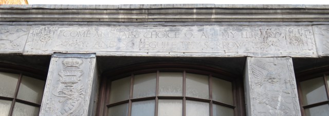
Stratford-on-Avon
At both Weston-Super-Mare and Stratford-on-Avon the frontage of the shop included a lead panel displaying the text: ‘Come and take choice of all my library and so beguile thy sorrow’. This Shakespearian quote is from Titus Andronicus, Act 4, Scene 1. At one time the Cheltenham shopfront quoted Wordsworth: ‘Dreams. Books are each a World and Books we know are a substantial World both pure and good’. Above this a lead panel took its text from Edward Bulwar Lytton’s The Souls of Books: ‘The world so loud & they the movers of the world so still’.
Gill Lettering
W. H. Smith’s beautiful lettering was designed in 1903 by Eric Gill. This font was used for the first time on the fascia of Smith’s shop on the rue de Rivoli in Paris, where it was hand-painted by Gill himself. It continued to be used by the firm into the late 1950s. The modern equivalent is known as ‘Gill Fascia’.

St Albans
On fascias or signboards, the name of the firm, W. H. Smith & Son, was picked out in gold or white on a blue (often tiled) ground. This survives in St Albans, together with secondary signage reading ‘newspapers stationery’ and ‘booksellers bookbinders’. The current blue and white livery was introduced in 1997.
Tile Pictures
Pictorial tile panels in an attractive and colourful art deco style adorned the top corners of Smith’s distinctive recessed shopfronts in the 1920s and 1930s. Made by Carter & Co in Poole, these panels were effective advertisements for particular categories of goods such as postcards, books, guides and road maps.

Rickmansworth

Rickmansworth

Tenby

Tenby
In a recent study (published in the Journal of the Tiles and Architectural Ceramic Society in 2015), Ian M. Betts found these tile panels at 60 Smith’s branches. In general, they survive in small towns, for example Rickmansworth, Tenby, Great Malvern, Llandudno and Newtown. Others are now in museums, such as the Museum of London and the Jackfield Tile Museum, in W. H. Smith’s own collection, or in the hands of private collectors. Still more possibly remain in situ, covered up by paintwork or later shopfitting and awaiting rediscovery.

I’m from Weston-super-Mare, and I’ve always wondered what that sign meant. Nice to know a bit of history!
LikeLike
I have just spotted one in Kingsway in London
LikeLike
Pingback: WH Smiths – Colwyn Bay
There’s a mystery photo on Flickr of an unknown WH Smith & sons location. Any idea where it could be located? It doesn’t seem to match exactly to any of the common photos online. https://www.flickr.com/photos/picturepast/48744199561/in/faves-78204816@N08/
LikeLike
Pingback: W. H. SMITH – MARSHALL COLMAN