
Lincoln Avenue, York, Nebraska in a ‘CT Art-Colortone’ postcard of the late 1940s, detail.
In the 1940s, the American variety retailers F. W. Woolworth & Co and S.S. Kresge stocked ‘linen’ postcards of their downtown stores. Most of these cards were ordered by individual store managers from the sales agents of the Curt Teich Company of Chicago. They were manufactured by a process known as ‘CT Art Colortone’, which had been in use since the early 1930s. In fact, Woolworth was ordering these cards by 1935, since some of the earliest examples show the ‘5 and 10 cent’ signage, abandoned in that year. Fortunately, the date of each view can usually be determined from its series number. The technique was emulated by some of Teich’s rivals, but went out of fashion in the early 1950s, superseded by polychrome printing.

Fifth Avenue, New York City, in a ‘Colourpicture’ postcard.
With their bright colouring, sharply-focused signage and embossed ‘linen’ weave, these cards have the appearance of miniature artworks, rather than the black and white photographs on which they were based.
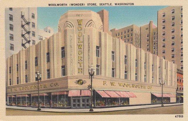
Woolworth ‘Wonder’ Store, Seattle, Washington. The building was completely air-conditioned and had terrazzo floors. It featured columns of ‘Gold Grain Tennessee Marble’ and had three ‘fully equipped lunch units’. The card was manufactured by a local company: C. P. Johnstone Co.

Lincoln Avenue, York, Nebraska.
What makes the linen postcards from the early 1940s especially fascinating is the realisation that equivalent images of contemporary European shopping streets simply do not exist. In American cities, Woolworth and Kresge had no need to tape display windows in case bombs exploded nearby. Kerbs (or rather, curbs) and posts did not have to be daubed with white stripes so that drivers could navigate through nightly blackouts. And the availability of fuel meant that automobiles were plentiful. Older vehicles were often airbrushed out, and the presence of glossy sedans with hard tops, long bonnets and shining fenders – often diagonally parked – heightens the modernity of the scenes. Looking at these cards, Europeans may have felt as if they were gazing into a parallel universe.
Postcards of streetscapes had been produced in a similar style, albeit using different techniques, in 1930s Britain. It might be argued that these aimed to impart some American glamour to British high streets.
The profoundly deaf artist Edward William Trick (1902-91), who studied under John Shapland in his home town of Exeter, painted watercolours which formed the basis of many cards manufactured by Valentines. The majority of these depicted well-known tourist spots: idyllic landscapes, piers and promenades, boats and harbours. Amongst these picturesque views, however, were important buildings (town halls, castles, churches) and some shopping streets. The style is rather chocolate-box, reminiscent of illustrations in Ladybird books or children’s jigsaw puzzles.
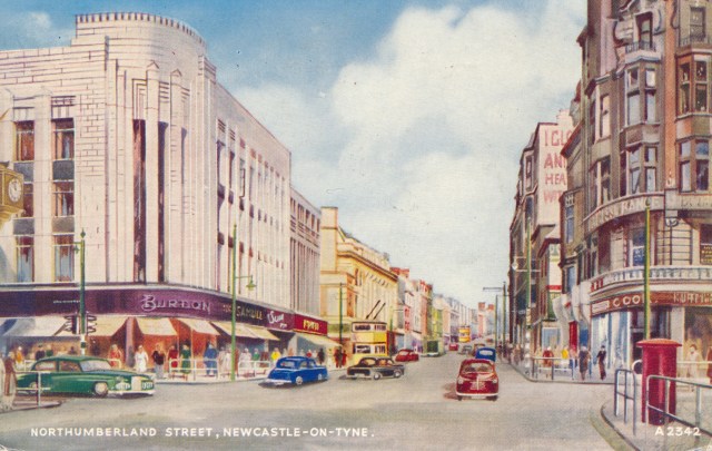
Northumberland Street in Newcastle is depicted in a Trick postcard, with Burton’s store in the foreground. As in Woolworth’s and Kresge’s postcards of the 1940s, new cars are particularly prominent and give the view a modern edge, matching the fashionable art deco style of Burton’s store. Street details are fascinating. The guard rails, for example, reflect the increasing dominance of the car, obtained by imposing new restrictions on pedestrians, usually in the name of safety. Just beyond Burton’s, Woolworth’s store is identifiable by its vivid red signboard. This was built in 1936, casting some doubt on the Valentine’s series numbering, which indicates a date of 1935. Burton’s splendid store has unfortunately been demolished.
 The appeal of Inverness to the typical visitor was certainly not its modernity, rather its charm as a traditional Highland town. Here it is depicted by another Valentine’s artist, B.F.C. Parr. Again the series number implies a date of 1935. As yet, art deco store fronts like Burton’s in Newcastle had not disrupted the gentility of the High Street, and the prevalence of retractable awnings was distinctly old fashioned. Nevertheless, it is notable that the cars are up-to-date and a new-fangled traffic light is prominent in the foreground. Perhaps the town fathers thought that such amenities would attract the touring motorist. The only multiple retailer with an obvious presence here is Boots, a company much less aggressively modern in its approach to buildings than Woolworth or Burton.
I find these tinted views of mid-20th century shopping streets irresistible, and shall continue to seek them out in charity shops and at card fairs.

fascinating, I can see the attraction of these postcards. I’ll try not to enter into a bidding war with you on e-bay.
LikeLike