Store 128: Southampton (c.Historic England)
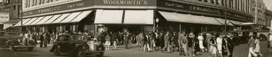
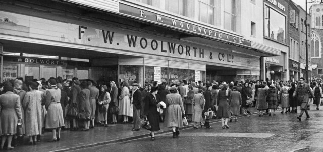
F. W. Woolworth & Co Ltd occupied a prominent spot on British High Streets for nearly a century, from 1909 until 2009. Beneath the red and gold signboard of the famous 3d and 6d stores, the form of the shopfront – the arrangement of the entrances and display windows – evolved hand-in-hand with more modern approaches to retailing. The fascia, and even the trading name of the company, also changed over the years.
A high-class London shopfitter, Frederick Sage & Co, was instrumental in designing Woolworth’s first British shopfronts. Sage was certainly responsible for the Manchester shopfront of 1910, and probably designed shopfronts for very first British store, on Church Street in Liverpool. Other work by Sage included Harrod’s store in London.
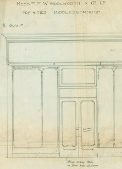
Store 8: Middlesbrough (c.Historic England)
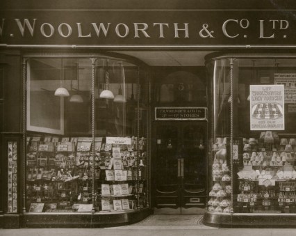
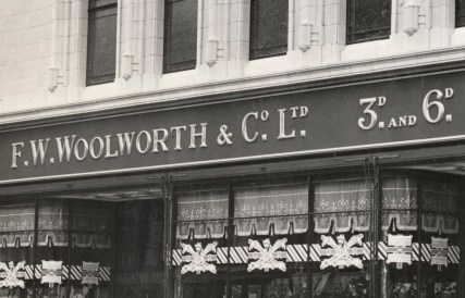
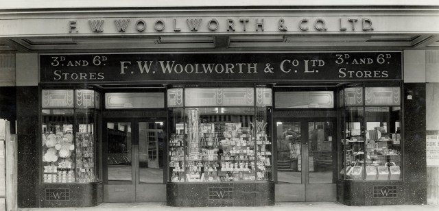
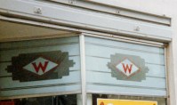
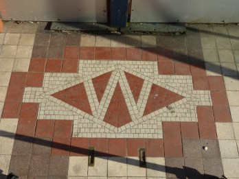
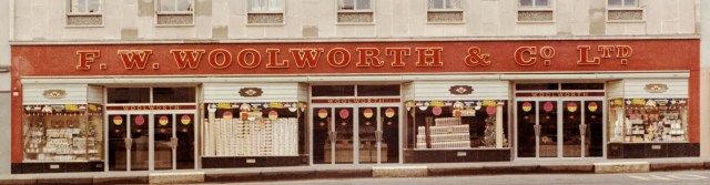
Woolworth’s maintained its original ‘house style’ with little change until the Great War. Each shopfront had a bronze frame. The entrance lobbies had distinctive features: part-glazed double doors with kick plates and push plates; large fanlights; decorative plaster ceilings, and floor mosaics with the ‘Diamond W’ logo. Barley-twist colonnettes separated the display windows, while a ventilation strip along the top prevented condensation from clouding the plate glass.
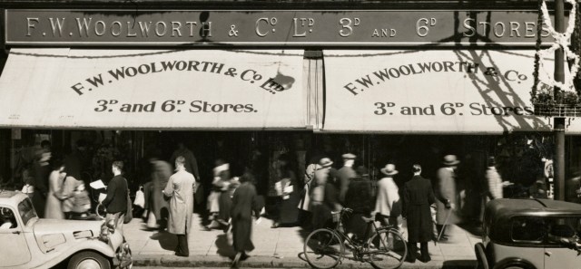
‘F. W. Woolworth & Co. Ltd. 3d and 6d Stores’ was spelled out in gilded letters on the low emerald granite stall-risers, under the windows. The name was repeated on the high red and gold fascia and on the retractable canvas sun blinds.
Store 6: Hull (c.Historic England)
The standard design – which closely resembled Woolworth’s American store fronts – was simplified after the Great War. The barley-twist colonnettes became plain, of square section, and small pediments were introduced over doors. Internal lighting, fixed above the displays, superseded external arc lamps. As a result, from around 1922 fringed pelmets or valances with a floral pattern were hung along the tops of the windows to screen the lights and reduce glare. These remained in place into the 1940s.
Store 113: Lowestoft (c.Historic England)
Store 157: Grantham (c. K. Morrison)
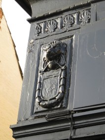
From 1923 until the early 1930s Woolworth’s fascias were bracketed by consoles (or ‘trusses’) decorated with lion’s heads. A shield bearing the letter ‘W’, bordered by husks, was suspended from the lion’s mouth.
From the late 1920s, simpler moulded consoles of reconstituted stone were preferred. These were always positioned at the top of polished granite pilasters.
Although several lion’s head consoles have survived – they can be seen, for example, in Bath and Grantham (with the ‘W’ erased), and on the Strand in central London – Woolworth’s 1920s shopfronts have largely gone.
In contrast, several shopfronts installed in the 1930s can still be spotted, for example in Bideford (1938), Ilkeston (1938), Ledbury (1937), Leytonstone (1934), Ludlow (1933), Hertford (1934), Monmouth (1932) and Saffron Walden (1934).
Store 464: Monmouth (c.Historic England)
By 1935 Woolworth’s new in-house architect, B. C. Donaldson, had started to introduce art deco touches to store design. Opaque glass panes patterned with ‘W’s, chevrons or waved bands were installed over the window displays, in place of the old-fashioned fabric pelmets. These were made by the London Sand Blast Co. of Islington, and examples can still be seen occasionally, for example in Frinton-on-Sea (1935). The form of entrance doors also gave way to more modern taste in the mid-1930s, becoming much simpler.
Store 713: Finchley Road, London (c.Historic England)
Store 939: Matlock (c.Historic England)
The shopfronts of the first wave of purpose-built post-war Woolworth stores, built in the early 1950s, were of chrome or stainless steel rather than bronze. The curves of the pre-war shopfronts gave way to sharp, modern angles.
Illuminated fascias were of white glass with red Perspex lettering, and the transom lights over the window displays were of Belgian white glass, with horizontal lines, usually superimposed with the red ‘Diamond W’ plaque. The ‘Diamond W’ still featured on entrance floors. Above the doors was a strip, 7ins high, with the word ‘Woolworth’ in gilded lettering on a red backdrop.
Store 44: Norwich (c.Historic England)
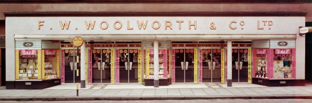
Important branches now had shopfronts with streamlined marble surrounds, for example ‘San Stephano marble’ at Bristol (1952). This replaced the traditional architectural surround of fascia and pilasters. It was set with gilded, red-rimmed, sans serif letters. Later in the 1950s many pre-war shopfronts were updated with louvred pelmets, essentially Venetian blinds, which took the place of the last remaining fabric pelmets.
Store 869: St Ives, Cambs (c.R. Baxter)
One of the biggest changes to occur in the 1950s was the gradual switch from solidly-backed window displays to so-called ‘clearview’ fronts. Entrances effectively became more important than windows. The armour-plated entrance doors widened and multiplied – giving unobstructed views of interiors – while displays of goods shrank. As a result, free-standing structural supports appeared on frontages – these had previously been hidden inside windows.
Store 166: Stirling (c.Historic England)
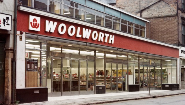
Through the 1960s surrounds were usually either red or grey, of mosaic or granite, though other materials were used, including formica ‘Beautyboard’. Until 1965 letters were of sans serif type, of gold with red outlines. Letters with neon tube edging, with names such as ‘Regency’, ‘Embassy’ or ‘Kent’, were manufactured for Woolworth by Pearce. In 1965 the sans serif lettering was superseded by blocky Egyptian lettering, called ‘Shrewsbury’ lettering, which could be red or yellow and often assumed a gigantic scale. From summer 1968 the full name of the company was dropped from new fascias and replaced with ‘WOOLWORTH’. Increasingly, the ‘WOOLWORTH’ lettering was set directly on the building rather than on a fascia.
Store 1107: Banbridge (c.Historic England)
Around 1970 Woolworth’s began to clad shopfront pilasters and external structural piers in white oblong tiles supplied by Langley’s. Fascias were normally of mosaic tiles (still red or pale grey), ‘Stelvetite’ (plastic-coated steel, usually white), fibreglass or, from 1976, ‘Duraform’ (reinforced plastic sheeting). Towards the end of 1971, the Egyptian lettering was abandoned in favour of italicised sans serif letters – either white on a bright red mosaic ground, or vice versa.
Store 147: Burton-on-Trent (c.Historic England)
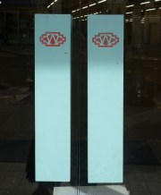
The new lettering of the 1970s was accompanied by the looping W, usually called the basket symbol or Winfield logo. Superseding the ‘Diamond W’, from 1973 it appeared on the push plates of a new design of stainless steel doors, referred to as ‘Hartlepool doors’. Lobby floors were now plain. Like many of Woolworth’s 1960s store makeovers, the new red-and-white look was not applied to the entire portfolio, just to new and remodelled stores. Many outlets continued to display older forms of lettering for years to come.
Store 27: Newcastle (c. Emily Cole)
Several experimental shopfront revamps followed the acquisition of Woolworth by Paternoster (Woolworth Holdings) in 1982. The one with the greatest impact – enduring through the Kingfisher years – had an aluminium frame, powder-coated in peppermint blue, with miniature ‘Diamond W’ logos on the push-plates of the doors. Above, the fascias were sprayed with buff-coloured ‘Wallglaze’ and set with acrylic red-faced, gold-edged ‘WOOLWORTHS’ lettering, sometimes given blue edging. The new name with an ‘S’ officially superseded ‘WOOLWORTH’ in March 1986.

Store 317: Wellingborough (c. K. Morrison)
Woolworth Group, formed after flotation in 2001, again experimented with various designs before settling on a red and white livery with a swoosh logo for mainstream stores. This house style endured until the bitter end, in the winter of 2008-2009.
Read more about Woolworth’s history: Kathryn A. Morrison, Woolworth’s 100 Years on the High Street, Historic England, 2015.

Pingback: Grantham – Store 157 | Woolies Buildings - Then and Now
Pingback: Shrewsbury Woolworths – Store 312 | Woolies Buildings - Then and Now
Pingback: Frinton-on-Sea Woolworths – Store 658 – Woolies Buildings – Then and Now
Pingback: Ammanford Woolworths – Store 1038 – Woolies Buildings – Then and Now